Basic Color Theory

Color theory encompasses a multitude of definitions, concepts and design applications - enough to fill several encyclopedias. However, there are three basic categories of color theory that are logical and useful : The color wheel, color harmony, and the context of how colors are used. Color theories create a logical structure for color. For example, if we have an assortment of fruits and vegetables, we can organize them by color and place them on a circle that shows the colors in relation to each other.

The Color Wheel
By Color Matters
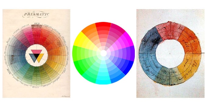
A color circle, based on red, yellow and blue, is traditional in the field of art. Sir Isaac Newton developed the first circular diagram of colors in 1666. Since then, scientists and artists have studied and designed numerous variations of this concept. Differences of opinion about the validity of one format over another continue to provoke debate. In reality, any color circle or color wheel which presents a logically arranged sequence of pure hues has merit.

Hue, shade, tint and tone
By Kris Decker
Let’s go back to that 64-pack of crayons from our first day of school. (Remember “raw umber”? What is an umber anyway, and is it actually better raw than cooked?) Anyway, you might be wondering, how we got from the twelve colors on our original color wheel to all those crayons? That’s where tints, shades, and tones come in.
Simply put, tints, tones and shades are variations of hues, or colors, on the color wheel. A tint is a hue to which white has been added. For example, red + white = pink. A shade is a hue to which black has been added. For example, red + black = burgundy. Finally, a tone is a color to which black and white (or grey) have been added. This darkens the original hue while making the color appear more subtle and less intense.

RGB: the additive color mixing model
By Kris Decker
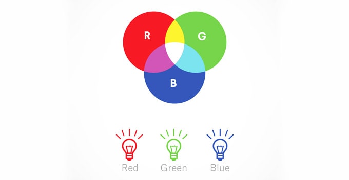
Humans see colors in light waves. Mixing light—or the additive color mixing model—allows you to create colors by mixing red, green and blue light sources of various intensities. The more light you add, the brighter the color mix becomes. If you mix all three colors of light, you get pure, white light. TVs, screens and projectors use red, green and blue (RGB) as their primary colors, and then mix them together to create other colors.

CMYK: the subtractive color mixing model
By Kris Decker
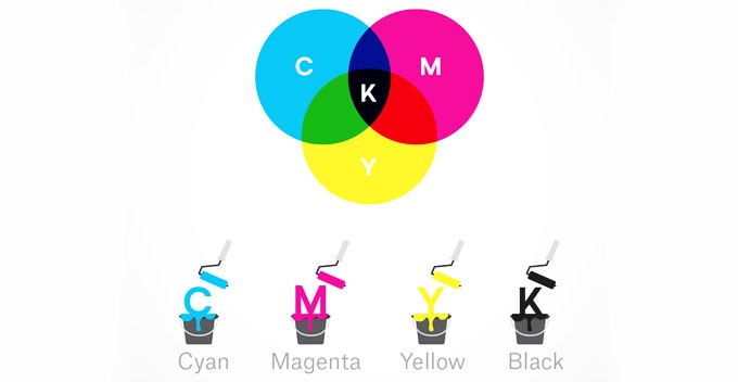
Any color you see on a physical surface (paper, signage, packaging, etc.) uses the subtractive color mixing model. Most people are more familiar with this color model because it’s what we learned in kindergarten when mixing finger paints. In this case, “subtractive” simply refers to the fact that you subtract the light from the paper by adding more color. cmyk color Subtractive color mixing is pretty close to the paint mixing we did in grade school. This video does a great job visualizing the “subtractive” part of it. Traditionally, the primary colors used in subtractive process were red, yellow and blue, as these were the colors painters mixed to get all other hues. As color printing emerged, they were subsequently replaced with cyan, magenta, yellow and key/black (CMYK), as this color combo enables printers to produce a wider variety of colors on paper.

Wram and cool
By Kris Decker
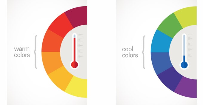
Draw a line through the center of the wheel, and you’ll separate the warm colors (reds, oranges, yellows) from cool colors (blues, greens, purples).

Warm colors are generally associated with energy, brightness, and action, whereas cool colors are often identified with calm, peace, and serenity. When you recognize that color has a temperature, you can understand how choosing all warm or all cool colors in a logo or on your website can impact your message.
Basic Color Theory